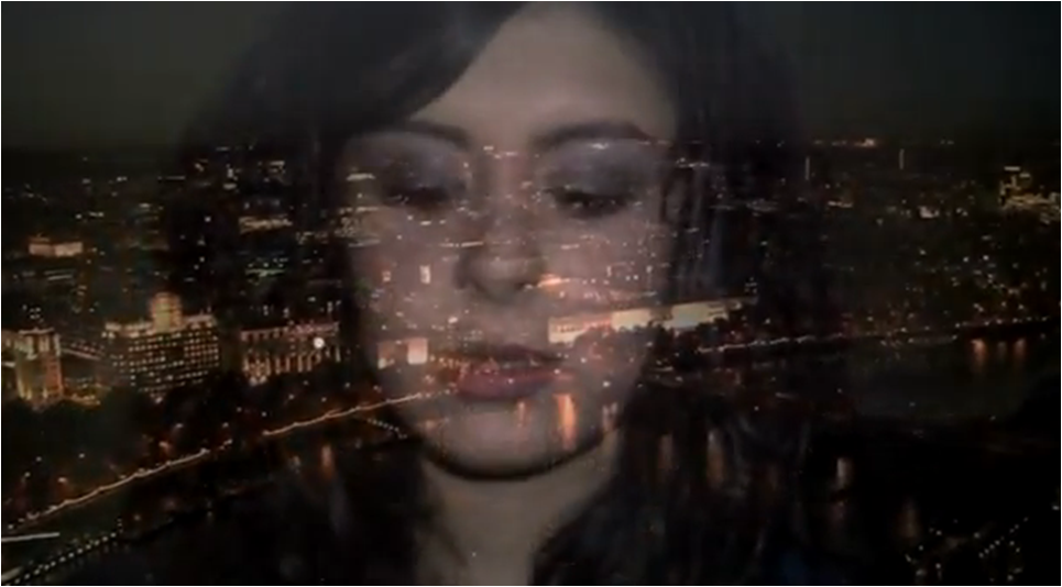
Final Music Video

Thursday, 8 December 2011

Goodbye


Dear Moderator,

Overall, I think my blog was consistent and organised as I always kept up with all my work. I particularly enjoyed learning how to experiment with different softwares such as Photoshop and Final Cut Express.

I hope you have enjoyed reviewing my coursework.

Thankyou, Khushel.

Wednesday, 7 December 2011

Evaluation 4: How did you use new media technologies in the construction and research, planning and evaluation stages?


Evaluation 3: What have you learned from your audience feedback?

For evaluation three both Yasmin and I decided that we would do something creative for this particular evaluation task and show off our skills by filming our peers and teachers answering a variety of questions based upon our music video ‘Hate This Part Right Here.’ We believed that by creating this video we would be provided with a much better, in depth profile of what our peers thought of our video and what improvements could be made in order to make it a successful music video. What is more, is that by filming and editing the footage we were able to take scenes out from our own music video and by ‘wire framing’ the footage we could incorporate segments of it and fit it into the evaluation video where people began to  comment on specific examples from our film. By doing this, our audience would be provided with a clearer, understandable view of areas which shone out to our viewers and those which captured their attention.


When it came to choosing a selection of people who would appear in our evaluation video, we decided that we would choose people who reflected our target audience, this being people aged between 13-29. We included a variety of college students and one teacher, one who is in their late 20s into our evaluation task so that we would be provided with information and opinions from people who come from different ethnicity backgrounds and are different ages. 

When filming our fellow peers and teachers for our evaluation video the majority of them answered the questions correctly providing us with positive, optimistic answers that we had originally wanted to hear from our target audience.


We asked our target audience, 'What they liked about our music video." One of the male sixth form students that we questioned, said "I really liked the effects you used with the fading and the shots of the whole of London and I also like the shot where the camera just focuses on you and there is a black background behind you. It was really good." This was a very encouraging comment for us to hear as we worked particular hard on the special effect shots of the London nightlife which were then blended in to the close ups of the artist's features. Additionally, it enabled us to realise that not only had the opening seconds of our music video interested and drawn in our younger audiences but it also branched out to the older end of our audience spectrum.

Another member of our target audience explained to us that he really liked "the relationship between the narrative and performance as it works really well in the song and the narrative really explained and amplified the song." Again, we were exceptionally happy with this feedback as Khushel and I wanted to make sure that there was a right amount of balance between the narrative and performances in the video and that neither concepts overpowered each other. Clearly, we created the video in a way that depicted this and thankfully our target audience liked the way in which we had organised and displayed these scenes.
An improvement for our video that was repeated a few times by our target audience was that, "the lip syncing could be improved slightly." Khushel and I completely agreed with this comment, as looking back at the video it does seem to appear that some of the shots with the artist singing, especially the close ups of the artist singing are slightly ahead of the music. However, it only seems to be ahead by a second or so, so it isn't a major flaw in the video but it would have definitely looked better had it been completely in sync with the music.


We asked another member of our target audience, someone who is in their late 20's, "What they liked about our magazine advert." He answered saying, "I thought the magazine advert was really good, it looks like a real advert and it is a strong image of the artist, it definitely looks real."  We were exceptionally pleased with this feedback as we were aiming to create a sophisticated and professional magazine advert to target our audience, that is, those aged between 13-29.

Another sixth form student provided us with a positive feedback stating, "I thought the magazine poster targeted the upper boundary of your target audience very well, which is very well done. It seems a lot more mature rather than having young, teenage colours added to it." Again, we were really pleased with this feedback as a member of our target audience was able to identify the target audience that we were trying to promote our artist to, by using the magazine advert.

We didn't really receive improvement feedback for our magazine advert. The majority of the people we questioned said, "I don't think it really needs improving, it's very good" and "I'm not sure because I really like it and if you were to change it, you would have to change it completely." Clearly, we were overjoyed that our target audience loved our magazine advert and that they didn't think anything needed changing to it! :D


Feedback received for the Digipak helped us acknowledge the good points and the weaknesses within the product. Most people suggested that, "The digipak fitted the genre well." Our main intention of the digipak was to ensure that the product fit the genre. We found all feedback given very useful as it helped us continuously modify the texts in order to cater for the target audience. As you can see from our journeys for the digipak panels, we have altered the panels significantly in order to be a success. We acknowledged all our feedback. For example, a male stated that you could change the colours slightly as they were quite "garish". If I would remake the digipak, I would possibly dilute the coulours in order for the interior of the product does not contrast as much.


After gathering feedback from the rough cut, I consumed this advice and noted all improvements which could have been made in order to create a successful final music video. I believe the feedback given was very constructive as it helped us identify the glitches within the video which were identified by a wide range of audiences. From ages to 17-30, the audience gave us a varied amount of feedback which created a significant input in terms of editing the final music video.

Evaluation 2: How effective is the combination of your main product and ancillary texts?


Evaluation 1: In what ways does your media product use, develop or challenge forms of real media products?

a) In what ways does your media product use, develop or challenge forms of real media products?


1) A shot that shows a link between lyrics and/or music and visuals.
In this shot, there is a clear link between the visual  imagery and the lyrics. During this shot, the lyrics read, "driving slow", we see the artist in the car singing whilst looking out of the window suggesting that she is acknowledging her surroundings.


2) A shot that typifies the way a record company would want their artist to be represented.

This shot exaggerates the emotions of the artist. With this shot, the record company could present the artist as an innocent, loving girl who most females can relate to as she expresses emotions which all of this gender can feel empathetic toward, creating an iconography for the artist.


3) A shot that illustrates how your video use music genre.
This shot shows the pop video as the artist has background dancers during the chorus creating an upbeat and energetic section of the song. The casual clothing suggest a very typical feel of the genre as the costumes within the pop genre is simple yet sophisticated.


4) A shot that shows an intertextual reference.
This shot was taken from the fashion shows where a woman struts down the catwalk with pride feeling as tall as she can be. The shot shows empowerment of the artist. The cross fade of the view of London was inspired by the traditional American sitcoms such as CSI which of whom have an establishing shot of the state in order to set the scene in the opening.
 5) A shot that demonstrates your use of camera.
A low-angled shot of the dance scene at night showing different angles of the scene, creating an interesting shot in terms of the positions of the dancers and the lighting. The shot highlights the dancing in a very unique way due to the low angle that it was shot in.
 6) A shot that demonstrates your use of lighting.
The lighting used in this shot was very soft yet powerful as it highlights the artists face and the audiences are instantly drawn to her face. In this shot, as it was quite dark, I used a significant amount of lighting to create a focus on the artist and the levels which the shot was taken also has an impact on the lighting of the shot.
 7) A shot that demonstrates your use of mis-en-scene.
Within the shot, the artist is ready to go out with her partner. Therefore she is dressed in a nice black dress and a cardigan showing her ready to go out. The artist looks tired of what her relationship suggesting she may not want to go out with her partner.
8) Shots which I feel demonstrate something which shows I have watched other music videos.
This shot is taken from the video by Lady Antebellum, "Need You Now". The shot shows the female rushing to her window looking very fed up of her relationship. This shot is incorporated in our video when the artist is getting ready in her room. when she is fed up of her relationship.


9) Shots which I feel demonstrate something which shows I have watched other music videos. 
This shot was inspired by the video by Nicole Scherzinger, " Don't Hold your Breath", the video was shot within the back of a vehicle. This was an inspiration when creating our video as we decided to create care scenes to demonstrate the relationship falling apart.


b) Here are the nine key frames that are taken from other music videos.


1) This is a shot of the music video for "Just the Way You Are" by Bruno Mars, this shot was chosen as the shot shows the artist playing with a tape reel to create hair, this links with the lyrics, "Her hair falls perfectly". This shows a clear correlation between the lyrics and visuals.

2) This is a shot from Rihanna's music video, "Only Girl", this shot identifies her new star image as she had changed her hair colour recently for her new debut album. The shot changes her to attract more of a target audience. This is a perfect example of how the record label could represent the artist.

3) Beyonce's video, "Single ladies" illustrates the R&B and Pop genre as the dancers are very upbeat and synchronized. The genre is also identified by the leotards worn by the three females within the video suggesting acts of voyeurism.

4) Rihanna's video, "Only Girl" shows intertextual references as it is inspired by the idea of a young girl running through a clear field full of poppies which is shown in movies and books quite often. It creates a very calm and peaceful atmosphere.

5)This shot is from Pixie Lott's video, "All About Tonight". The use of camera in this shot is very intriguing as it is a close up of the artist walking straight. However, her legs never manage to move out of the original framing suggesting a  very genius way of filming the footage.

6) In Beyonce's video, "Halo", the lighting is truly amazing. The white filters within the shots are so soft and beautiful, they deeply compliment the lyrics of the song.

7) Demonstrates a clear mise-en-scene as it shows a girl in a very casual costume having a great time suggesting that she is very laid back.

8) This shot Lady Antebellum's video, "Need you now",  links in with our video as it shows the boyfriend waiting outside the room of his partner, this shot inspired us in the making of our narrative as we decide to have the partner waiting outside the bedroom door of his girlfriend.

9) This shot from Nicole Scherzinger's video, "Don't Hold Your Breath", is linked to our video as it shows the artist in the back of a vehicle portraying her emotions about her partner, we used her video as an inspiration when creating the storyboard.


Goodwin Analysis on my Video
Genre Characteristics: The video contains many different aspects which help the audience acknowledge the genre. However the dance performance within the video is the most powerful in depicting the genre as it consists of the conventions of a pop video, due to the idea the fact that the location is empty and the dancers perform in the style of a pop routine.


Relationship between lyrics and visuals: The video consists of a strong relationship with the lyrics and visuals. For example, the lyrics state "Thought that we were stronger" and the dancers flex their muscles creating a clear correlation between the two features.


Relationship between music and visuals: The beginning of the video is a soft and calm tune of a piano being played. However, as the music goes along the tempo becomes extremely up beat as slowly more and more instruments begin to play and you begin to here drums and varieties of sounds. This creates a nice link between the cross faded imagery seen in the beginning.


Are there any close-ups of the artists star-image motifs: We found it very important to ensure that our artist would be well established, therefore we included many close-ups of the artist in order to promote her. We have included a series of close-ups of her in order for the audience to sympathize with her emotions and facial expressions.


Reference to notion of looking: The video often focuses on the artists specific body parts such as the lips, hips and legs suggesting a form of exploitation of her sexuality. However, when we decided on the artists image, we had decided not to flaunt off her body in a sexual manner bu t instead, simply just emphasize the dancing skills and her singing.


Is the video performance,narrative or concept based: The video consists of a mixture of both narrative and performance.


Vernallis Analysis on my Video
Editing: 

  • There are consistent cuts in the editing that match the beat of the song. (1:20)-(1:25)
  • The video may break/disrupt any rules of continuity. (2:48)-(2.54)
  • Editing may become foregrounded and edits may become obvious. (0:09)-(0:43)

Camera Movement & Framing:

  • Common extreme shots.(0:02, 0:04, 1:37, 2:50)
  • The camera may move on lyrics or  in time with the music.(0:44)-(1:15)
  • Frequently used establishing shots and close ups. (0:26, 2:10, 2:38)

Diegesis:

  • Actions are not necessarily completed.(2:49-2:55)
  • There may be gaps in the audience understanding for the diegesis.(1:20)-(1:54)
  • May be repititions of imagery and themes.(0:26, 1:16, 2:10)

Monday, 28 November 2011

Front Cover

Above is the front cover that I decided was appropriate to use within the digipak as it includes many effects to create a very fun and interesting look to it. The colours almost bring the image out without looking washed out. However, there are far too many dark patches within the face of the artist.

To change this I decided to duplicate the original image in order to enhance the artists face and to create a presence within the video. I used the clone tool in order to match the facial skin tone to the dark patches within the cover.


I also changed the font in order to keep it within the theme of calligraphy, this led to the positioning and resizing of the text in order to bring the star out more. I researched if the artists name was bigger than the album name and that was the case in all of the covers that I saw.

My effects journey for the front cover


This reel of photos shows the processes which undergone to produce the front cover.

Thursday, 24 November 2011

Part One Inside Panel


Feedback: 
- I like the colour of the digipack, the glow. I like the effect on the hat, whereby there are a mixture of different colours contrasted together. I also like the lyrics that are placed on top of the singer and are showcased across the singers hat. (Feedback given by male aged 17)

- The shot itself is quite good as you can see the artist. The mise-en-scene is spot on, the hat represents the image of a singer/songwriter. I'd scale back the effects, it seems to tampered with, if you strip it back because it is the first album because the fans need to know the artist before they start distorting the image. (Feedback given by male aged 17)

- Perhaps change the clarity of it, not very clear. Don't like the text, not very clear either. I like the picture effect thats been used. (Feedback given by male aged 17.)

- The writing looks unclear, looks a bit blurry. I like the vibrance effect looks good and I like the way the artist is looking down and the hat is slightly covering the artists face. (Feedback given by male aged 17.) 

After reviewing all of the feedback given from our peers, we decided to change the background and the colour of our text as the white background was far too contrasting with the rest of our panels. This panel now fits the theme of our digipak as a galactic and more fun theme to cater for our audience. 


Final Back Cover of the Digipak


Feedback:

  • The concept of the cover is very creatively thought out and it is nice how you have listed as all the tracks on each key of the piano. It is a clear distinction that this is a power ballad and in the R&B genre. 
  • The use of the piano is well accomplished, however there is a empty space which could have been changed as overall its too black. 
  • The instrument creates a main focus of the back and it suggests a possible iconography of the artist . All conventions which are on the back cover have made a very clean and professional cover. However the barcode and websites seem quite cramped.
After looking over the feedback, I decided to add colour to areas to create a less empty feeling within the video as well as keeping with a theme throughout the digipak.


Back Cover of digipak so far

Record Label Logo


In order to create a successful back cover, I had to look very closely at the conventions within a digipak back cover. I founded that most back covers consist of a record label logo that is usually placed on the right hand side of the back cover. I created this record label logo to be put onto the back of the digipak in order to create a professional outcome. I played with the inner and outer glows on photoshop in order to create a nice effect within the logo.

Wednesday, 23 November 2011

Vernallis Analysis- Nicole Scherzinger: Don't Hold Your Breath


Nicole Scherzinger's video has had a part in inspiring our own production within our video. We have taken great notice of the car scenes within it, in order to create a perfect edit.

1. Narrative
The narrative is set in the back of what seems to be a taxi or vehicle where the artist is simply wearing a males shirt and nothing else. She looks as if she is tired of the way that she has been treated. She then takes off the shirt and changes back into her own clothes, suggesting that she was in rage with her partner and did not want any recognition of him.

Its a rainy day suggesting the breakup in the relationship. The lyrics and visuals clearly correlate with one another as they talk about the pain given in this relationship. There is a close-up of the artist looking back from the vehicle in disgust as if she was thinking he would never get me back.

The narrative then transitions to her walking in what seems to be an empty house with many ladders, suggesting that shes moving out of her comfort zone as shes tired of the treatment given to her. She then walks to the bathroom and sings in front of the mirror implying that she is reassuring herself that she had made the correct choice.

Then suddenly the Narrative discovers a  transformation as the artist comes alive as sunlight appears  showing that she is very powerful and seeming very inevitable.

Throughout the video, there are crosscuts of the artist almost caged under a from of fabric suggesting that she was hiding to protect herself, suggesting that hiding underneath would help her escape from reality.

This video shows evidence of Carol Vernalliss' four key concepts of the construction of music videos. The narrative clearly has a visual response towards the music as the visuals emphasize the mood throughout, for example the close-ups of the artist in the car shows clearly that she was not intending on returning to her partner. Vernallis believes that there is not necessarily a balance between narrative and performance, this is clearly evident as throughout the video, there is more of a narrative compared to performance. This shown when she is in the vehicle and within a house which reflects her past and experiences. This narrative is fragmented as only shows one side of a story.

2. Editing

The video overall has distinct conventions of music video editing as there are many disruptions of the 'rules' of continuity. However, this does not stop the clean edits in terms of matching the musical phrases and beats within the song. The video has very sharp editing as there are cuts within in the lyrics which are designed to correlate with the lyrics. As soon as the beats within the song change pitch, the editing changes along with it suggesting the clear change in atmosphere.

3. Camera Movement & Framing
The master shot within this video is of the artist in the back of the car, this shot is used very frequently within along with close-ups which exaggerate the artists iconography. The camera moves in time with the music and changes the movement in time with the beat of the song. The framing throughout is constantly of center which becomes distinctive within the video.

4. Diegesis
The video consists of many repetitions in terms of diegesis and there are gaps within the diegesis within time and space, music and performance. The close-ups are more significant than other shots shown within the video.


Monday, 21 November 2011

Final Digipak Cover


Collage of photographs collected from our digipack photoshoot:

Digipak Alternative Ideas


After thinking really hard about the cover, I had come to a conclusion that the entire format and layout was more of a form of poster. I decided that whatever that could be done to the image would still not change the overall look of it. Therefore, I decided to re-start the entire front cover.

Digpak Front Cover in Progress


I decided that I could maybe alter the aesthetics by changing the background of the cover to enhance the artist more and to draw the audience into the cover. I did this by changing the colour of the top and adjusting the levels of the colour. I decided to change the font which could match the theme of the image.

Rough Idea of our Digipak Front cover


This was our rough version of the album front cover. However, I decided that it was too similar to a standardized photo shoot. It was far too plain to consider having as a digipak front cover.